The Unconscious Influence of Typography in UX Design
Welcome to 'Unconscious UX', a series shedding light on the subtle yet powerful aspects of design that silently shape our experiences and guide our behaviours. These unsung heroes of design often go unnoticed, their impact lying beneath the conscious surface, but their influence is undeniably crucial in crafting exceptional user experiences. As we delve into the intricate world of 'unconscious' design choices, we hope to help you appreciate these quiet game-changers that keep the digital realm turning. Our first focus? The hidden titan of design - typography. Let's uncover its covert power in directing user perception and emotion.
You might think that typography, the unassuming cousin in the broader family of design elements, tends to sit quietly in the background. But don't be fooled. Much like the invisible strings that control a marionette, typography governs our perception and behaviour in ways we hardly notice, but can't ignore. And this influence? It's far from trivial.
Typography: A Story Etched in Time
Gutenberg’s Printing Press circa 1440
Our journey with typography began centuries ago. It's a fascinating tale that starts with the invention of movable type in China, makes a pit stop at Gutenberg's press, and continues to this very day on our digital screens. Along the way, cultural and technological shifts have left their marks, painting a picture of the times in the form of typefaces.
At its essence, typography is the harmonious marriage of form and function – a delight to the senses that serves a purpose. It presents a message that's not only easy to read but aesthetically pleasing. And for UX designers? Well, it's the hidden key that unlocks the door to a user's heart and mind.
Typography: The Underdog of Design
Despite its undeniable significance, typography often ends up playing second fiddle to the 'louder' elements of UX design: colour, images, and interactivity. Many might dismiss its power as mere aesthetic fluff, or assume that it's all about 'content'. However, dig a little deeper and you'll find that the choice of typeface can be a game-changer, influencing readability, user mood, and even trust.
Typographical Tunes: How They Shape User Behaviour
The influence of typography on user behaviour is like a subtle melody played by an orchestra – it moves us, even if we can't quite put our finger on the notes. It makes reading a breeze, triggers emotional responses, and guides us through the labyrinth of a webpage.
Picture this: you're reading a long blog post. The typeface is straightforward and pleasing to the eye – a simple Georgia perhaps. Then, a headline in bold catches your attention. Imagine if this were reversed – a blog post in a flamboyant, complex font. Would you stay or stray? Studies show that a reader's tolerance for poor typography is surprisingly low.
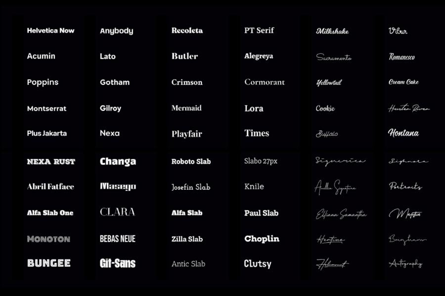
And then there's the emotional element. The typeface sets the tone – whether it's the authority of Times New Roman or the modernity of Helvetica – playing a role in how users perceive your content.
Lastly, typography acts as an unspoken guide. Different sizes, weights, and styles whisper instructions to the user, helping them navigate and absorb information effortlessly.
Typography in Action: The Impactful Stories of Apple and Medium
Companies like Apple and Medium have used typography as a maestro would use an orchestra – to create a beautiful symphony of user experience.
The San Francisco typeface, introduced by Apple in 2015, is popularly known for its chic minimalism. It was created with readability as its primary focus, ensuring that the experience of reading on any device, be it a tiny Apple Watch screen or the grandeur of a Mac display, remains seamless.
Mastering the Art of Typography: A Guide for UX Designers
So, how do we weave the magic of typography into our design tapestry? Here are a few pointers for the aspiring maestros out there:
The Clarity Mantra: Never compromise on readability and legibility. Choose typefaces that are easy on the eyes and ensure your text is accessible to a diverse range of users.
The Brand Harmony: Align your typeface with your brand identity. Whether you're all about tradition or a symbol of modernity, your typography should reflect that.
The Guideposts: Use typography as signposts to guide users through your site. Different font sizes, weights, and styles should create a clear hierarchy of information.
The Test Drive: Don't forget to test your typefaces with users. Gather feedback, experiment with alternatives, and find what works best for your audience.
The Audience Mirror: Remember, your typography should mirror your audience's preferences. The typeface that resonates with a younger crowd might differ from one that an older audience prefers.
The Typography Connoisseur: An Informed User's Guide
Understanding the language of typography can help users navigate digital spaces more effectively. Here are a few things to keep an eye on:
Spot the Readability: Can you read the text easily? If not, it might be a sign that the brand needs to revisit its typography choices.
Feel the Emotion: Does the typeface stir any feelings within you? Notice these subtle emotional shifts. It might just help you understand the brand better.
Watch the Consistency: Do you see a common thread in the typography across a brand's digital presence? If yes, it reflects a commitment to a consistent brand identity.
The Last Word
In the realm of UX design, typography is often seen as a humble gardener, tending to the beauty of the layout in an unassuming manner. Yet in truth, it is the very lifeblood of the design ecosystem, coursing through every element, bringing vitality and coherence. It nurtures user experience, shapes brand perception, and fosters a sense of harmony in the digital landscape. Let us, therefore, recognize typography as the essential life force it truly is. For even in its silence, it speaks volumes, and in its subtlety, it brings about profound transformation.
Want to share your thoughts? Feel free to share them in the comments section below or on social media.


